Angelika Jirusova
Graphic designer

Adobe Certified Professional in Print & Digital Media Publication Using Adobe InDesign
Welcome to my design world
I create beautiful:
- Book layouts
- Covers
- eBooks (both fixed and reflowable)
- interactive projects.
- I also fine-tune HTML and CSS to ensure everything looks perfect in reflowable ePubs.
This website offers just a glimpse of my work. For a more comprehensive look at what I do, including promo videos, websites, and other creative projects, please check out my interactive resume.
I am proficient in:
- InDesign
- Illustrator
- Photoshop
- Canva
Let’s bring your ideas to life with clean, functional designs!

Prayer Book
Prayer Journal
Children/Educational Book
Public Domain/ Historical Book
INNOVATIVE RESUME: INTERACTIVE SHOWCASE
Lookinside
Click the “Read Now” button to be redirected to an interactive resume where you can find more about me and my work.
222 PRAYERS BOOK & EPUB
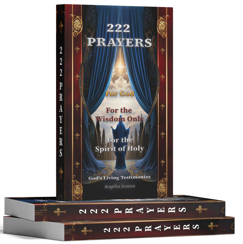
Cover Design for 222 Prayers
Prayer Book
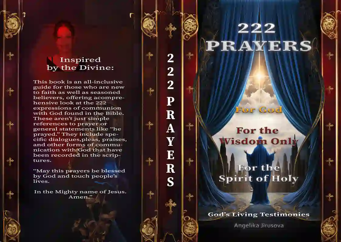
This book cover was intricately crafted based on a divine vision, where specific colors were revealed in a dream and assigned to the book’s key elements. The phrase “For God” was associated with the color yellow, symbolizing divine presence and light. “For the Wisdom Only” was linked to red, representing the holy fire of wisdom. “For the Spirit of Holy” was paired with white, reflecting purity and spiritual clarity. The design features majestic blue curtains parting to reveal a radiant light, capturing the connection between the divine and the earthly. Every element, from the gold accents to the symbolic use of color, was carefully chosen to embody the sacred messages of the book. This project is a testament to both the spiritual guidance received and the complexity of the creative process.
Interior Layout for 222 Prayers
The Layout Design of 222 Prayers
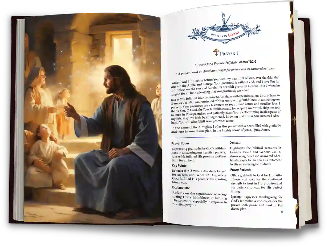
Involved careful attention to detail to ensure both aesthetic appeal and functional clarity. Each prayer is carefully structured with distinct sections, including the prayer text, key points, prayer focus, context, connection, and additional reflections. The layout harmonizes these elements, allowing for easy navigation while maintaining a visually engaging flow.
The use of decorative headers, consistent formatting, and strategic placement of text ensures that readers can connect deeply with the content.
The challenge was to balance a sacred atmosphere with readability, making the design both spiritually resonant and user-friendly. Every page reflects the complex interplay of design, content, and spiritual guidance, creating a seamless experience for the reader.
Flipbook
52 WEEK PRAYER JOURNAL FOR WOMEN
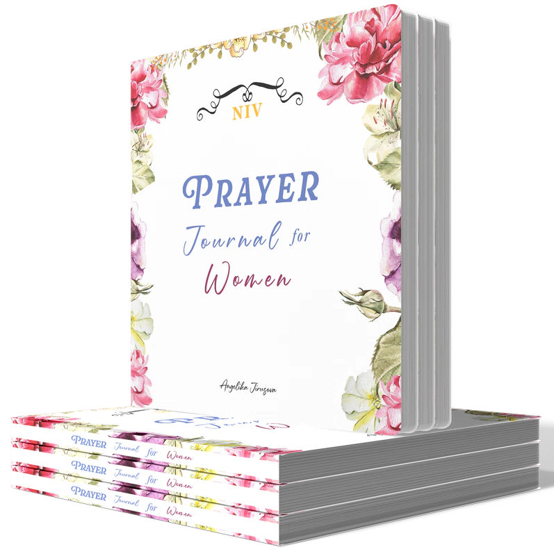
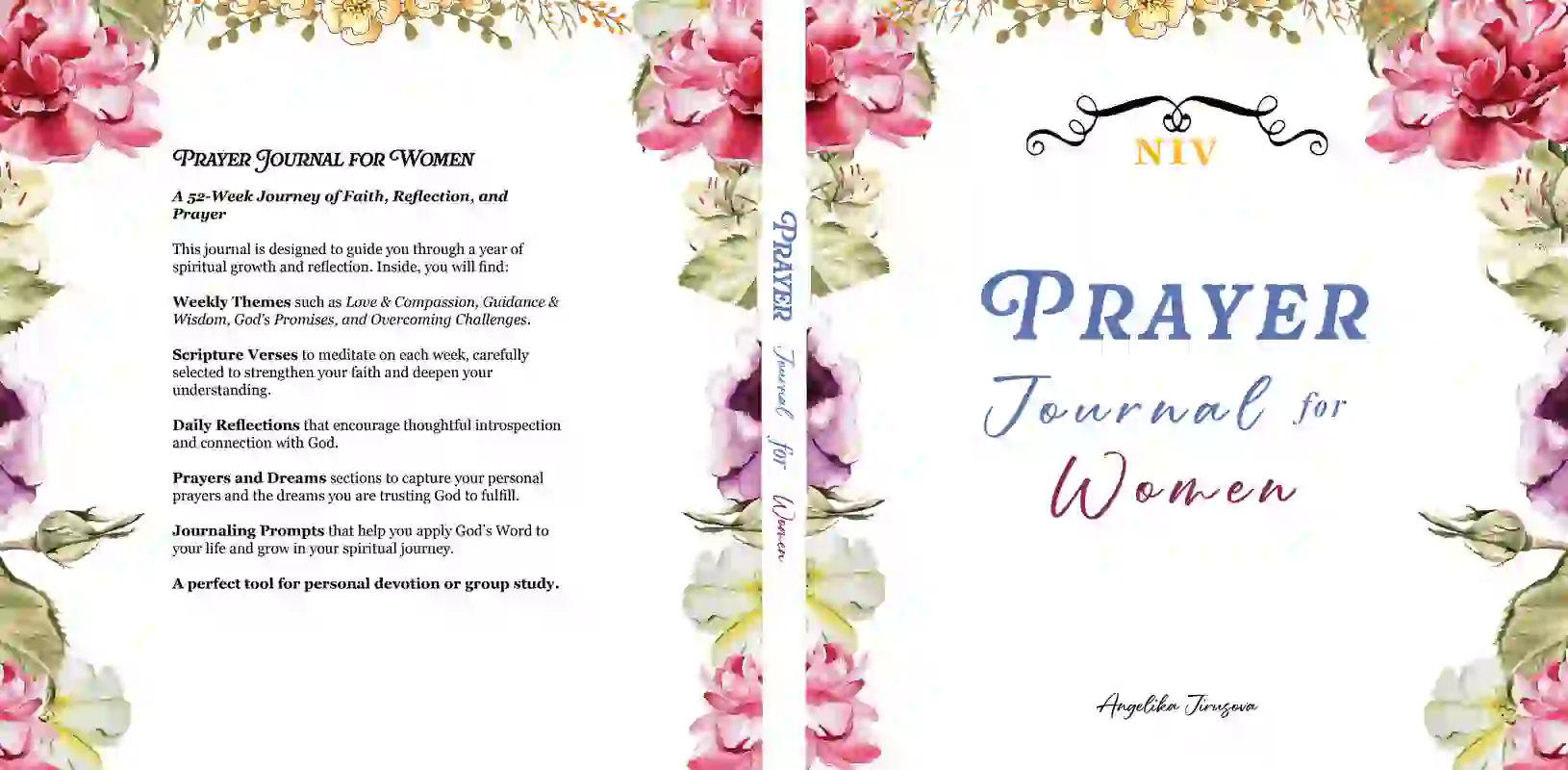
Cover Design for Prayer Journal for Women
Prayer Journal for Women Cover Design
This cover showcases my ability to create visually appealing and purposeful designs customized for journals. The design balances elegance with practicality, featuring:
- Floral Border: Hand-painted flowers frame the cover, symbolizing growth and renewal—key themes of the journal.
- Typography: The title uses a blend of classic and script fonts, creating a polished yet inviting look.
- Color Palette: Soft, gentle colors are chosen to evoke a sense of peace and reflection, aligning with the journal’s spiritual purpose.
This project highlights my skills in crafting designs that not only capture attention but also connect with the intended audience, making it ideal for clients seeking creative and effective journal covers.
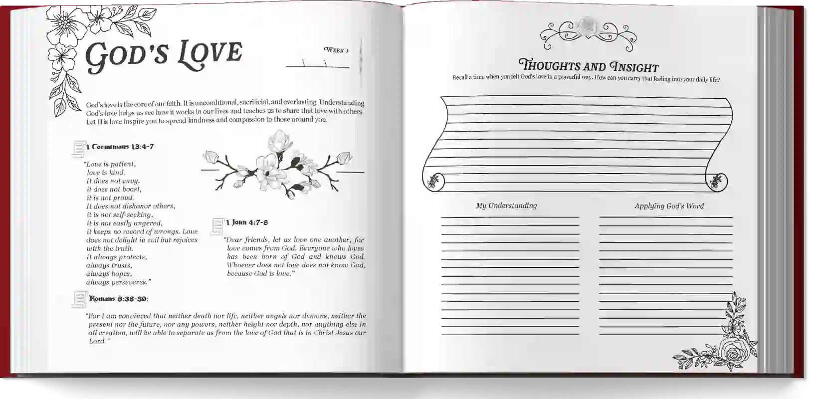
Interior Layout for Prayer Journal for Women
Prayer Journal for Women Layout Design
This layout showcases my ability to create functional and beautifully organized journal pages, designed to enhance the user’s spiritual journey. The journal includes a variety of sections that cover different aspects of reflection and prayer:
- Scripture and Reflection: Each week features a dedicated spread with carefully selected Bible verses, complemented by sections for “Thoughts and Insight,” “My Understanding,” and “Applying God’s Word.” These areas encourage users to meditate on the scripture and apply its teachings to their lives.
- Thankfulness and Requests: Pages titled “Thank You, God For” and “Asking God For” provide structured spaces for users to express gratitude and present their prayer requests, helping them maintain a balanced prayer life.
- My Thoughts: A dedicated “My Thoughts” section offers open space for users to jot down personal reflections, emotions, and insights, allowing for free-form journaling.
- Prayers and Answers: In the “Prayers” section, users can document their prayers, including the date, prayer details, and the date their prayer was answered. This layout helps users track their spiritual growth and see how God has worked in their lives.
- Dreams and Visions: The “Dreams and Visions” section includes areas for recording the date, details of the dream or vision, and God’s guidance. This section encourages users to reflect on how God communicates with them through dreams and visions.
- Notes: Additional “Notes” pages offer flexible space for any other thoughts, ideas, or spiritual insights that don’t fit into the other categories, ensuring the journal meets all the user’s needs.
This project highlights my skills in creating a well-rounded, user-friendly layout that supports spiritual growth and reflection, making it ideal for clients who need versatile and thoughtfully designed journal pages.
Flipbook
SILE OF THE SIDE - BOOK
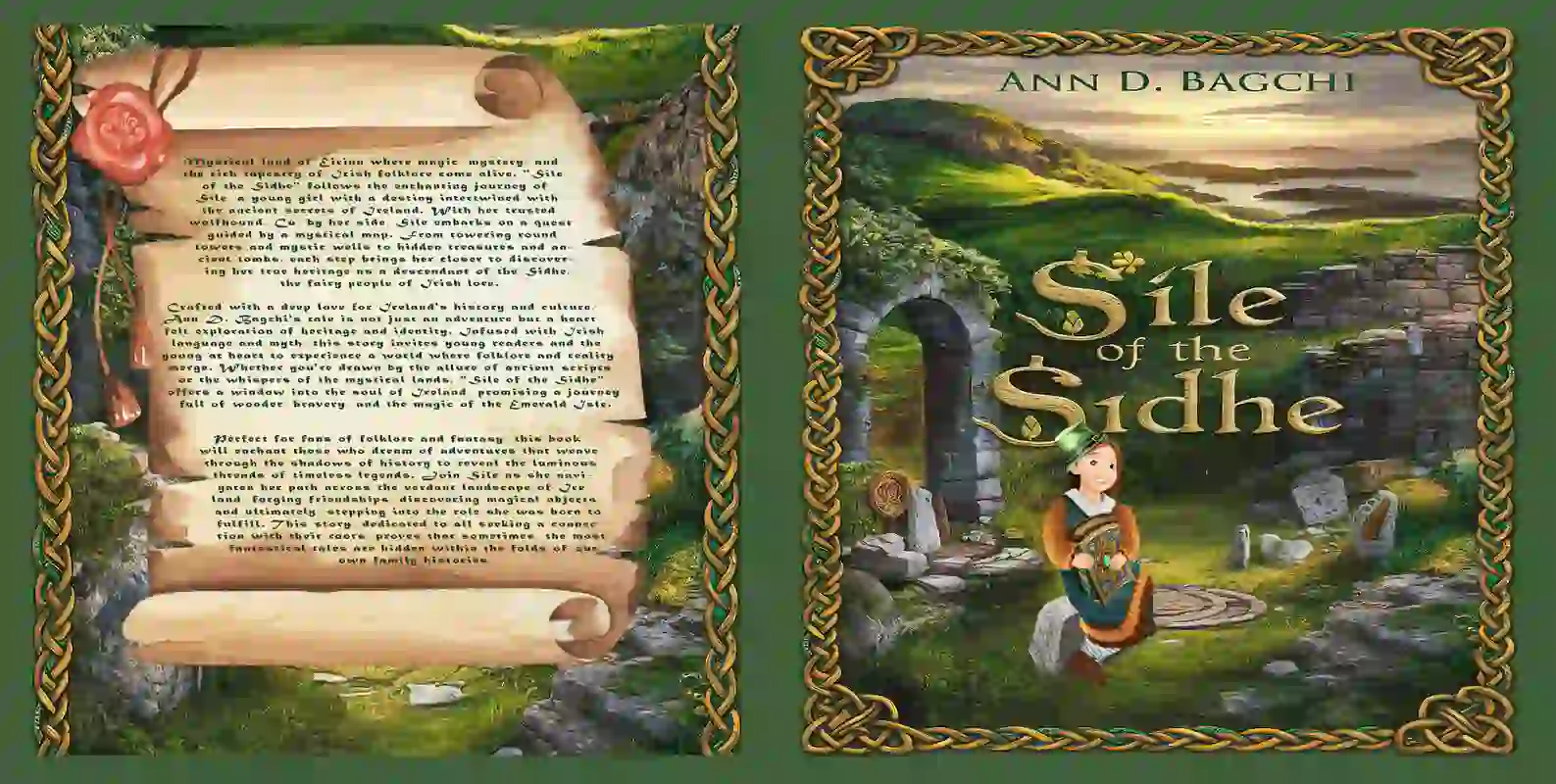
Cover Design for Sile of The Side
Children Book
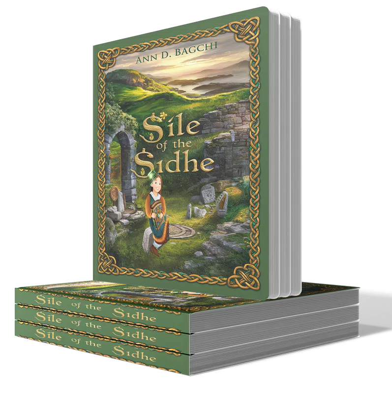
For this project, I designed a cover that captures the essence of Irish mythology and fantasy. The front cover features a lush Irish landscape with ancient stone structures, leading readers into the mystical world of Sile. The title is presented in a Celtic-inspired font, paired with detailed knotwork and a four-leaf clover to reinforce the theme. Sile, the main character, is illustrated in traditional Irish attire, adding warmth and approachability.
The back cover includes a scroll-like parchment with the book’s synopsis, bordered by intricate Celtic knotwork and a wax seal for an authentic, historical feel. The spine continues the knotwork, ensuring a cohesive design.
This project challenged me to blend cultural elements with storytelling, resulting in a captivating and thematically rich cover that appeals to both young readers and fans of folklore.
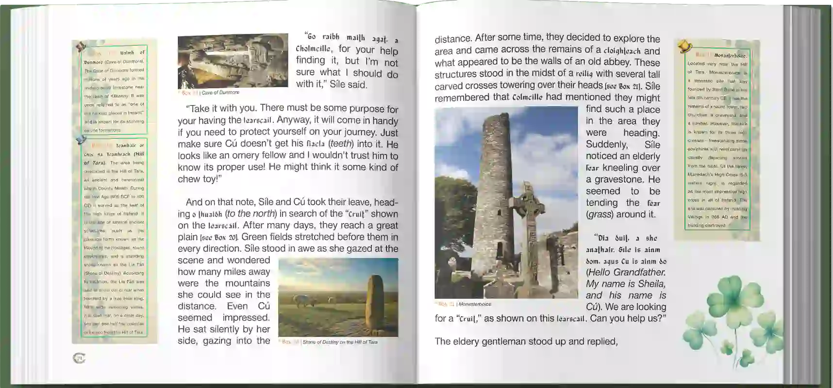
Interior Layout for Sile of the Sidhe
Designing the Interior of Sile of the Sidhe
Was a uniquely challenging and rewarding experience. The book, rich in Irish folklore and mythology, demanded a layout that not only complemented the enchanting theme but also facilitated an engaging reader experience, especially for younger audiences. The client’s vision involved creating a harmonious balance between text, imagery, and informative boxes that elaborated on various cultural elements.
Thematic Consistency: The design needed to reflect the Celtic aesthetic of the book’s cover, which is steeped in Irish tradition, featuring intricate knotwork and lush, green landscapes. This theme was carried through to the interior, ensuring a seamless visual journey from cover to content.
Integration of Elements: Each page was carefully crafted to include text, images, and explanatory boxes that enhanced the reader’s understanding of Irish myths and landmarks. The boxes provided historical and cultural context, making them an integral part of the storytelling.
Balanced Layout: The biggest challenge was balancing the diverse elements on each page. The text, images, and boxes had to coexist without overwhelming the reader, ensuring clarity and aesthetic appeal. Even the text itself was carefully balanced, with consistent amounts of content filling each page from top to bottom. This approach ensured that every page maintained the same visual rhythm and proportion, contributing to a uniform and cohesive reading experience.
Custom Explanatory Boxes: Special attention was given to the design of the explanatory boxes, which were styled with Celtic motifs to align with the book’s overall theme. These boxes were strategically placed to complement the corresponding text, enhancing the educational aspect of the narrative.
Image Placement: Images were carefully selected and positioned within the text to illustrate the story and the accompanying explanations. The images had to be relevant, engaging, and appropriately sized to avoid crowding the page.
Typography and Spacing: The typography was chosen to reflect the traditional yet magical tone of the book, with careful consideration of readability for a young audience. Adequate spacing was maintained to ensure that the text remained legible and the pages did not appear cluttered.
Outcome:
The final design of Sile of the Sidhe successfully captured the essence of Irish folklore while providing an immersive reading experience. The book is a visual and educational journey through the mystical land of Éireann, where every page is a blend of narrative, imagery, and cultural insights, meticulously balanced to delight and inform young readers.
This project showcases my ability to integrate complex design elements while adhering to the thematic and functional requirements of the client, resulting in a cohesive and engaging final product. Every detail, from the layout to the consistency of text and imagery, was crafted with precision to enhance the storytelling and maintain the book’s enchanting atmosphere.
Flipbook
Client's Review
MEN OF IRON - BOOK
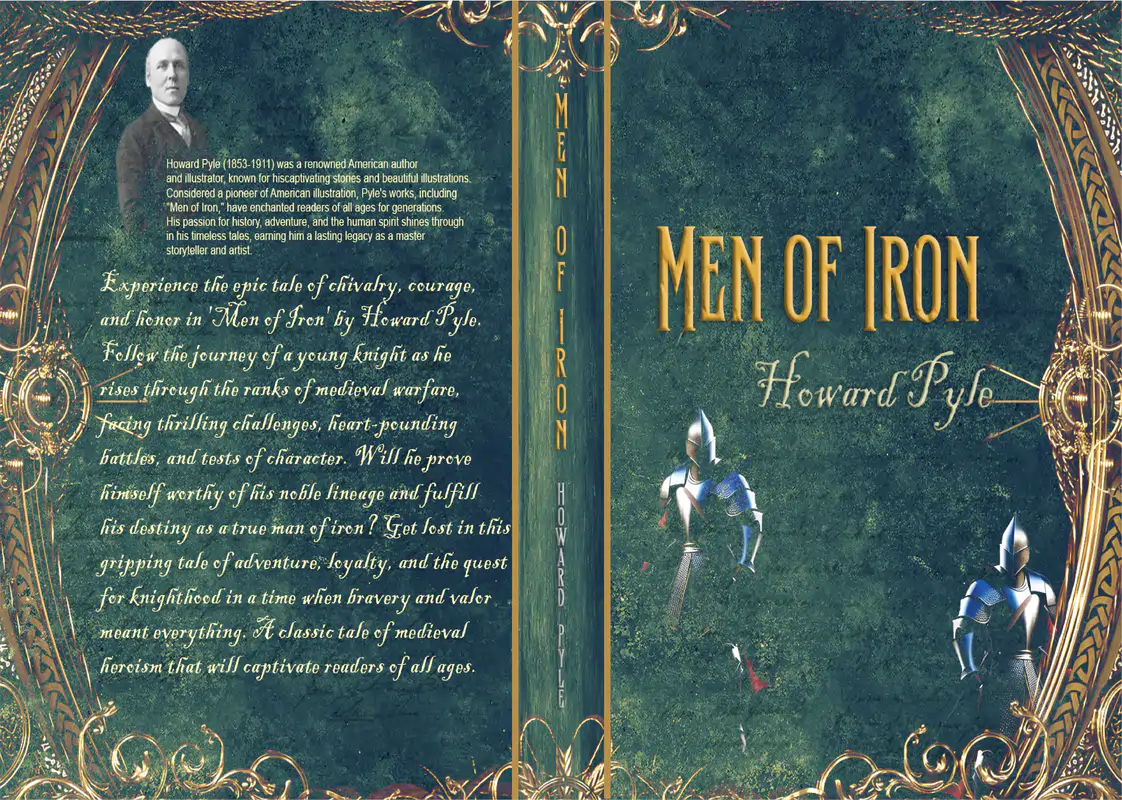
Cover Design for Men of Iron
The Cover Design for Men of Iron
Historical Book – Public Domain Book
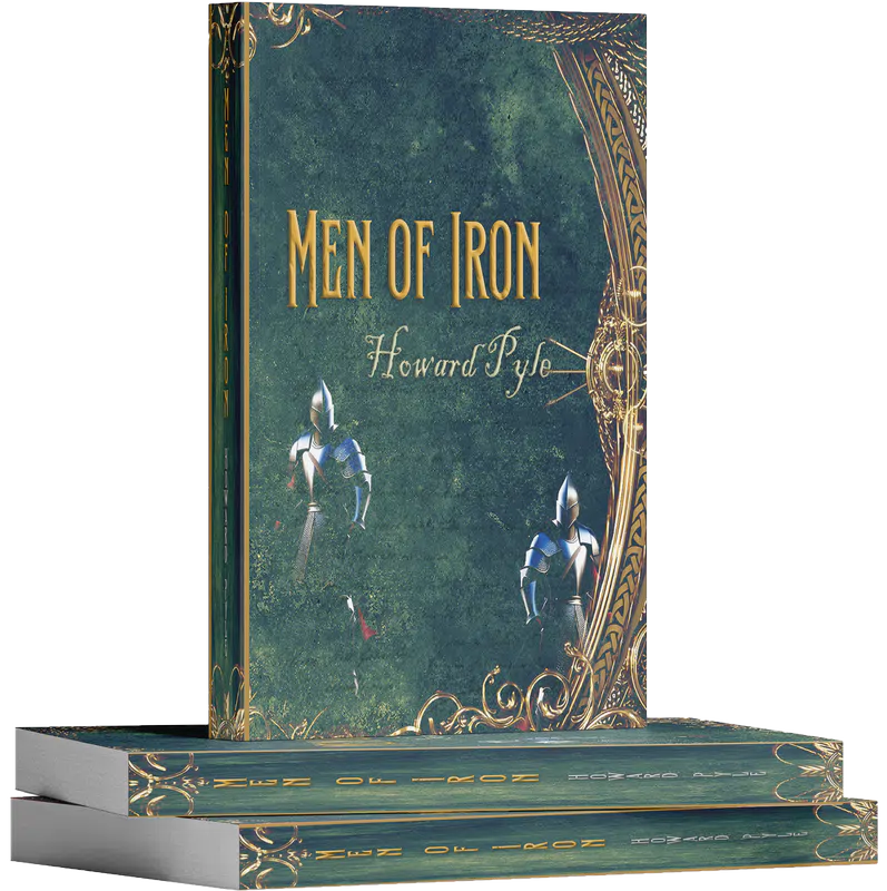
Reflects the spirit of medieval chivalry, featuring armored knights set against a deep green background that conveys a sense of nobility and courage. Gold accents and an ornate frame add a touch of elegance, aligning with the historical themes of honor and bravery in the story.
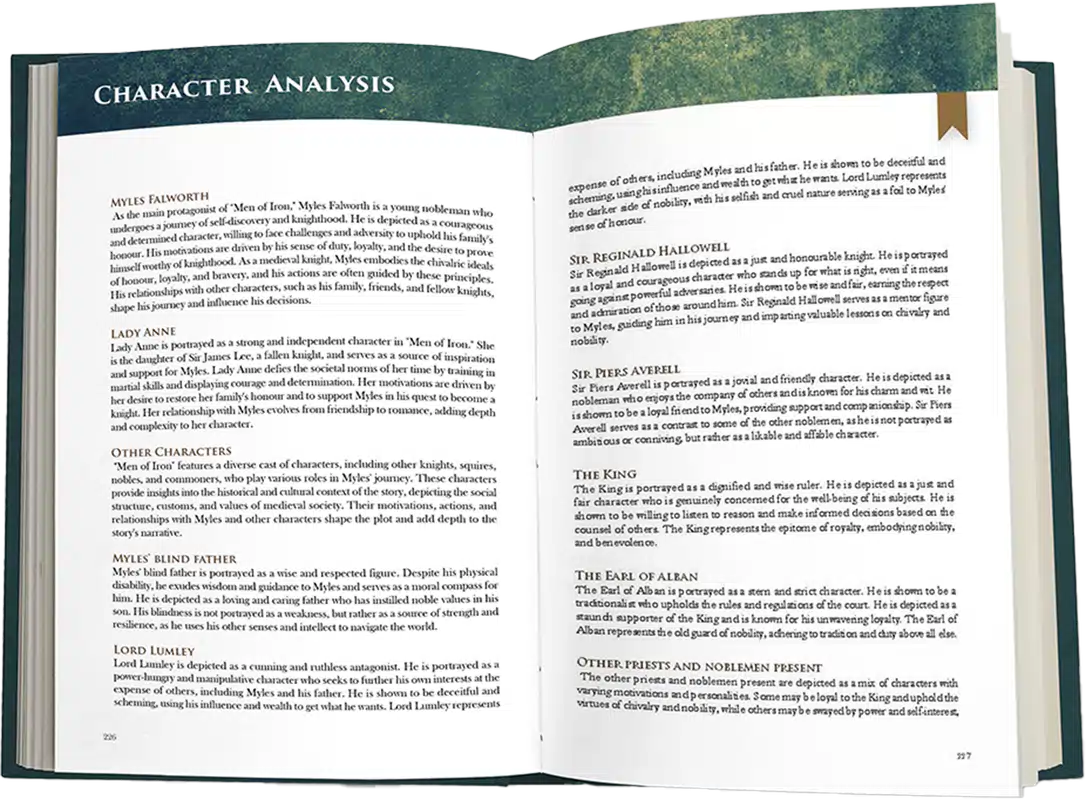
Interior Layout for Men of Iron
The Interior
Layout was designed to be both attractive and easy to read. The character analysis section, which I added to this public domain book, is organized to provide clear insights into each character. The layout balances text with space, making the content accessible and visually pleasing. Each section is carefully structured with consistent fonts and decorative touches that improve the overall reading experience. This project required a strong focus on both design and creating a cohesive, engaging presentation.
Flipbook
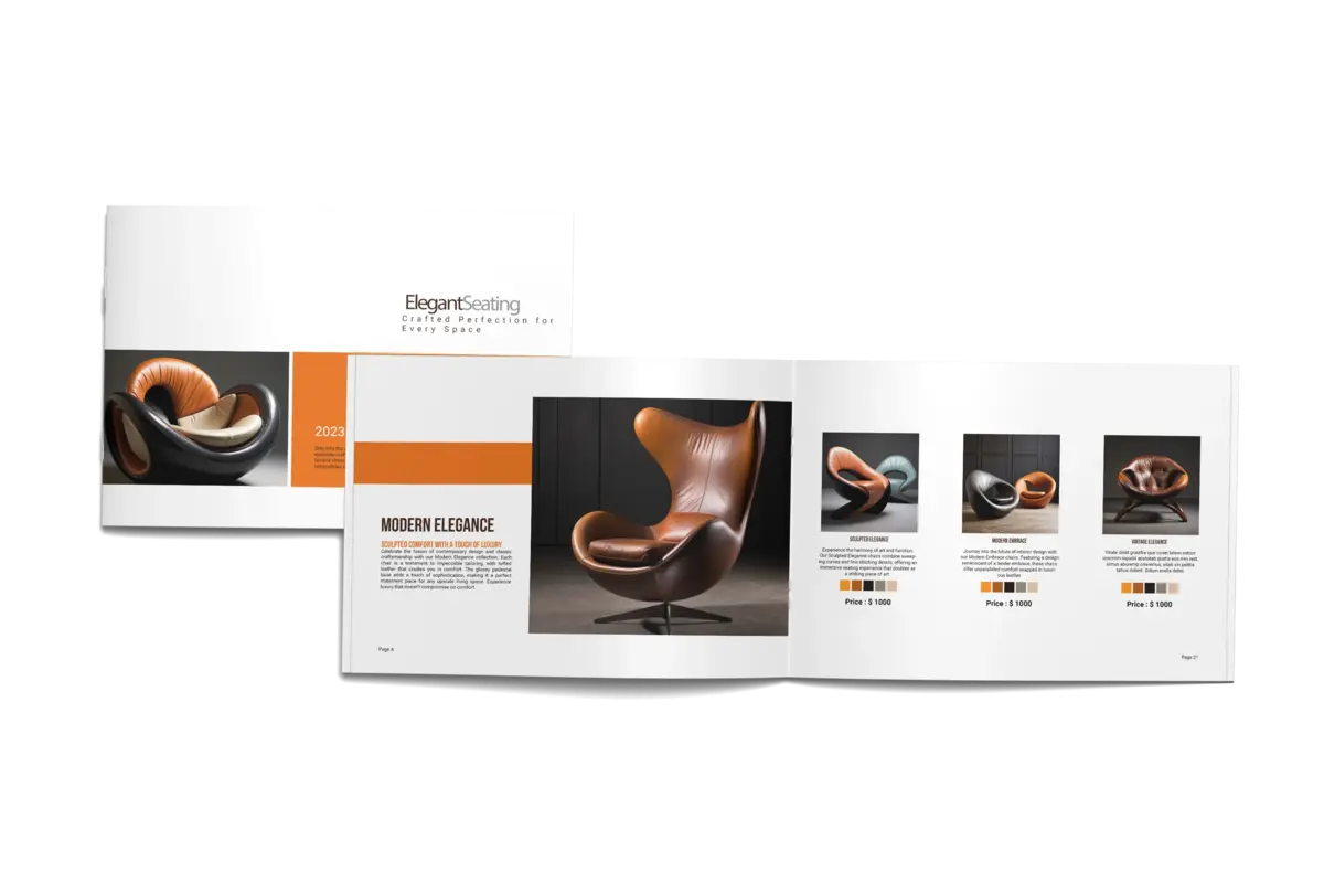
BROCHURE
MENU
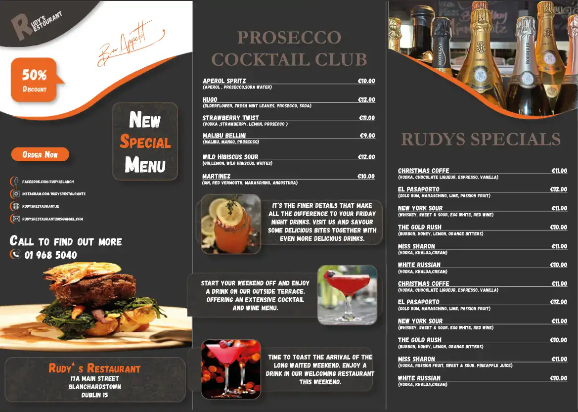
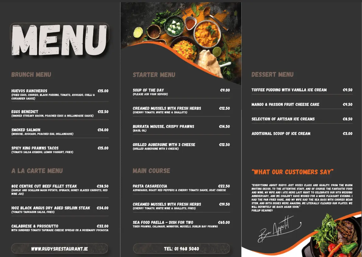
Restaurant Menus - Tri-fold (Front)
